


- Posts: 77
- Thank you received: 6
3 Post Moderation Rule for New Boarders (25 Jan 2021)
New boarders will have their posts moderated - Don't worry if you cannot see your post immediately.
Color Correcting
22 Jul 2013 15:49 #28919
by stewpid
Replied by stewpid on topic Color Correcting
Just thought I'd take this opportunity, while Simon is taking part in this thread, to say a big thank you to him for all the FREE plugins he has constructed and made available on this great forum. Thanks Simon.
And just in case, I repeat, I really have no connection other than as a happy user and someone who appreciates people who give their time and efforts freely.
And just in case, I repeat, I really have no connection other than as a happy user and someone who appreciates people who give their time and efforts freely.
Please Log in to join the conversation.
- Simon Ubsdell
-

- Offline
- Platinum Member
-

Less
More
- Posts: 350
- Thank you received: 337
22 Jul 2013 19:34 #28928
by Simon Ubsdell
First of all, great to hear you're liking Hawaiki Color and thanks of course for buying it!
In answer to your question, it's not currently possible to save presets, but you can of course use copy and paste, as you say, if you are wanting to duplicate the grade to use in another part of your timeline. Cmd/C to copy and Cmd/V to paste is the way to go if you don't have any other associated effects on your copied clip.
But don't forget that you can now also use Cmd/C followed by Cmd+Shit/V which will bring up a menu that allows you to paste only specific effects, in this case Hawaiki Color.
If you are wanting to store a specific grade for use later in the same project or indeed in another project, you should consider using the title version of Hawaiki Color which gives you a grading layer (much like Speedgrade). You can create a compound clip of your title version grade which will then be saved in your Event Browser for future use - it's a great way to save out grades that you're particularly happy with.
Also it's worth thinking about using the title version to try out different grades of the same shot - simply stack up instances of Hawaiki Color and disable the one(s) you're not working on. Great if you've got a picky director in the room with you who wants to see ten different looks.
It might also interest you to know that in future versions of Hawaiki Color we are planning to include a number of preset "looks" - not the crazy "look" "looks" that you sometimes see (sorry if you're a big fan of those!), but some of the more useful ones like CIne, Log, Bleach Bypass, etc. that can then form the basis of your own new grades.
Hope that's a bit of help.
All the best,
S.
Replied by Simon Ubsdell on topic Color Correcting
parkerhqj wrote: Just bought Hawaiki Color and I really like it. I don't suppose there is any way to save presets the way we can in the Color Adjustment tool in fcpx. Or some way to save the settings in Hawaiki? It seems that the only way to use the same settings is to copy and paste from one clip to another. thx
First of all, great to hear you're liking Hawaiki Color and thanks of course for buying it!
In answer to your question, it's not currently possible to save presets, but you can of course use copy and paste, as you say, if you are wanting to duplicate the grade to use in another part of your timeline. Cmd/C to copy and Cmd/V to paste is the way to go if you don't have any other associated effects on your copied clip.
But don't forget that you can now also use Cmd/C followed by Cmd+Shit/V which will bring up a menu that allows you to paste only specific effects, in this case Hawaiki Color.
If you are wanting to store a specific grade for use later in the same project or indeed in another project, you should consider using the title version of Hawaiki Color which gives you a grading layer (much like Speedgrade). You can create a compound clip of your title version grade which will then be saved in your Event Browser for future use - it's a great way to save out grades that you're particularly happy with.
Also it's worth thinking about using the title version to try out different grades of the same shot - simply stack up instances of Hawaiki Color and disable the one(s) you're not working on. Great if you've got a picky director in the room with you who wants to see ten different looks.
It might also interest you to know that in future versions of Hawaiki Color we are planning to include a number of preset "looks" - not the crazy "look" "looks" that you sometimes see (sorry if you're a big fan of those!), but some of the more useful ones like CIne, Log, Bleach Bypass, etc. that can then form the basis of your own new grades.
Hope that's a bit of help.
All the best,
S.
Please Log in to join the conversation.
- Mark Dobson
-
- Offline
- Junior Member
-

Less
More
- Posts: 22
- Thank you received: 2
22 Jul 2013 19:43 #28929
by Mark Dobson
Replied by Mark Dobson on topic Color Correcting
Hi Simon,
Thanks for the discussion and I look forward to trying out your version of the White Balancer when you release it.
I have to say that I don't find Cineflare's White Balancer clips the blacks at all. When you apply the filter you can see the whites being clipped slightly, that's before you reset the white balance. I'm editing files recorded in Canon C Log and the White Balancer does not lose picture information or my ability to manipulate the levels.
But really, getting a correct white balance out on location saves all this faffing around.
Thanks for the discussion and I look forward to trying out your version of the White Balancer when you release it.
I have to say that I don't find Cineflare's White Balancer clips the blacks at all. When you apply the filter you can see the whites being clipped slightly, that's before you reset the white balance. I'm editing files recorded in Canon C Log and the White Balancer does not lose picture information or my ability to manipulate the levels.
But really, getting a correct white balance out on location saves all this faffing around.
Please Log in to join the conversation.
- Simon Ubsdell
-
- Offline
- Platinum Member
-
Less
More
- Posts: 350
- Thank you received: 337
22 Jul 2013 19:59 - 22 Jul 2013 20:00 #28930
by Simon Ubsdell
Replied by Simon Ubsdell on topic Color Correcting
Hi Mark
It's always good to hear the views of someone who's out at the sharp end actually making the images! And yes, there's nothing like getting it right in the field - not always easy under tight circumstances but worth the extra effort.
To clarify what I mean about the black clipping in CineFlare WB, have a look at these two screengrabs, first the image before applying the filter and then with the filter applied but no correction:
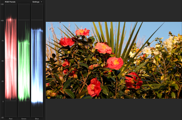
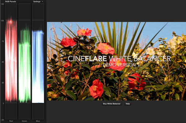
As you can see the blacks in the blue channel are getting chopped off at zero. If you increase the Contrast using the slider provided, all the channels get clipped in the same way.
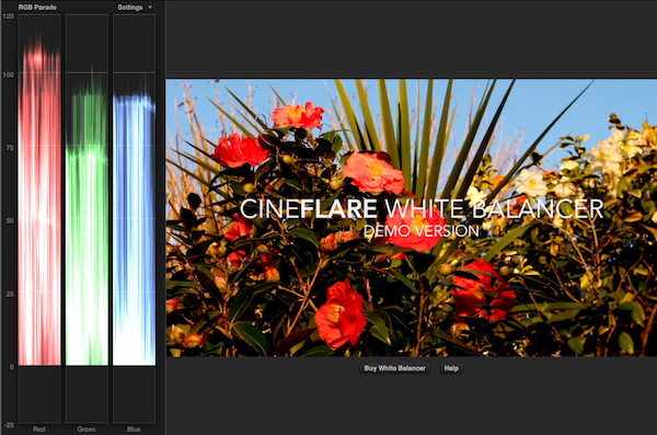
Not a disaster, but something to be aware of when using this effect.
All the best,
S.
It's always good to hear the views of someone who's out at the sharp end actually making the images! And yes, there's nothing like getting it right in the field - not always easy under tight circumstances but worth the extra effort.
To clarify what I mean about the black clipping in CineFlare WB, have a look at these two screengrabs, first the image before applying the filter and then with the filter applied but no correction:
As you can see the blacks in the blue channel are getting chopped off at zero. If you increase the Contrast using the slider provided, all the channels get clipped in the same way.
Not a disaster, but something to be aware of when using this effect.
All the best,
S.
Last edit: 22 Jul 2013 20:00 by Simon Ubsdell.
Please Log in to join the conversation.
23 Jul 2013 06:31 #28942
by stewpid
Replied by stewpid on topic Color Correcting
Simon, could you explain what the "Title version" of HC is? Thanks.
Please Log in to join the conversation.
- Mark Dobson
-
- Offline
- Junior Member
-
Less
More
- Posts: 22
- Thank you received: 2
23 Jul 2013 07:54 #28948
by Mark Dobson
Replied by Mark Dobson on topic Color Correcting
Hi Simon,
Yes, you are right. The Cineflare plugin does clip the files when using it's contrast control in an excessive manner.
Please see my attached JPEG of 4 screen shots.
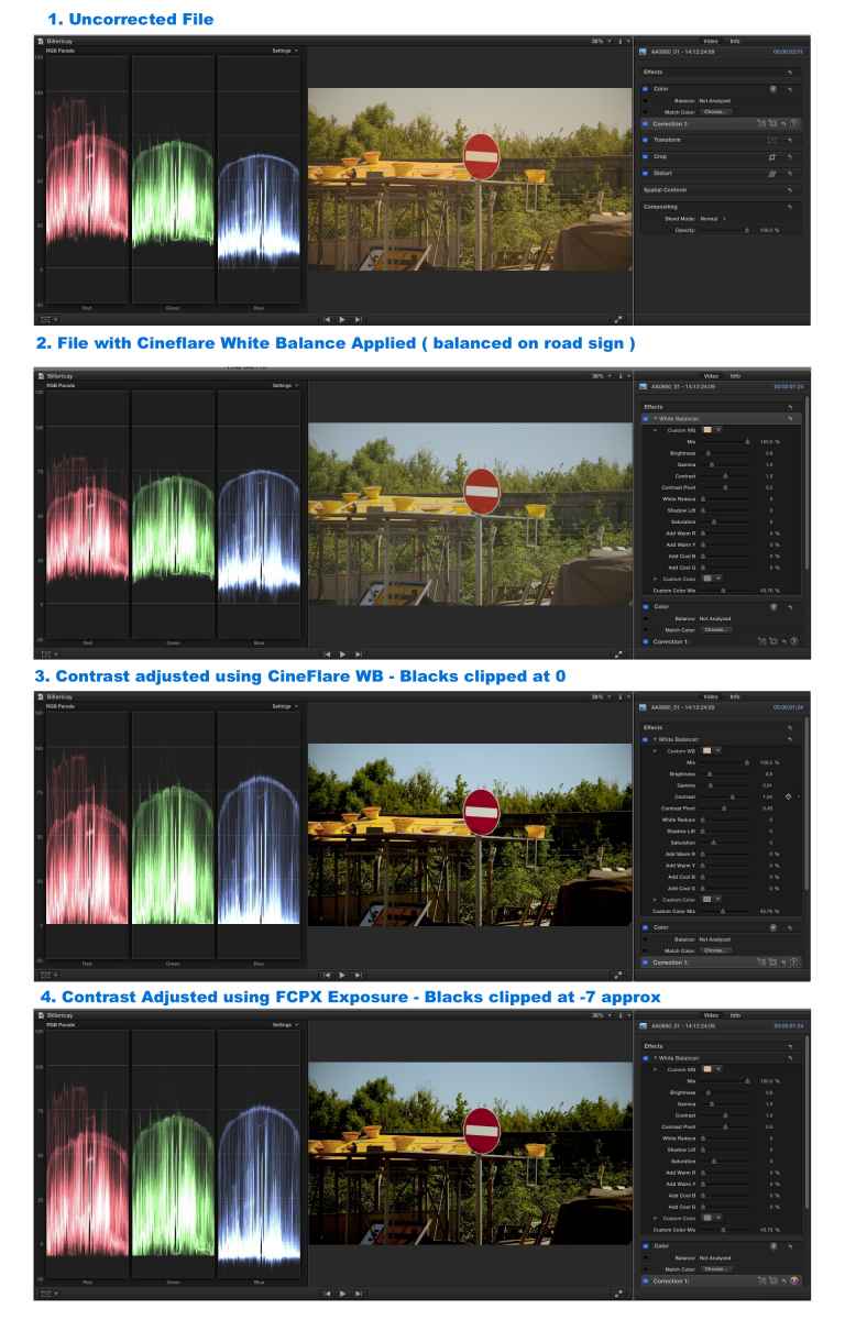
1. Uncorrected file needing WB correction
2. File with Cineflare WB applied ( Corrected on road sign which has reflected blue on surface so not a result I would use - I would sample the white sign in the shade to get an accurate reading but the result is not so dramatic for this demonstration )
3. Contrast Adjusted ( Excessive ) using Cineflare WB Contrast Control - Clips Blacks at 0
4. Contrast adjusted ( Excessive ) using FCPX Exposure controls - Blacks clipped at -7 approx
So the advice would be to avoid using Cineflares contrast controls. The information in the blacks is still there as demonstrated by using FCPX's Exposure control which seem to universally clip everything at -7 approx
I myself use Cineflare WB solely to adjust the white balance I've never used any of the other controls - too fiddly.
But I look forward to trying out your White Balancing Plugin when you release it and comparing it with the Cineflare WB.
Yes, you are right. The Cineflare plugin does clip the files when using it's contrast control in an excessive manner.
Please see my attached JPEG of 4 screen shots.
1. Uncorrected file needing WB correction
2. File with Cineflare WB applied ( Corrected on road sign which has reflected blue on surface so not a result I would use - I would sample the white sign in the shade to get an accurate reading but the result is not so dramatic for this demonstration )
3. Contrast Adjusted ( Excessive ) using Cineflare WB Contrast Control - Clips Blacks at 0
4. Contrast adjusted ( Excessive ) using FCPX Exposure controls - Blacks clipped at -7 approx
So the advice would be to avoid using Cineflares contrast controls. The information in the blacks is still there as demonstrated by using FCPX's Exposure control which seem to universally clip everything at -7 approx
I myself use Cineflare WB solely to adjust the white balance I've never used any of the other controls - too fiddly.
But I look forward to trying out your White Balancing Plugin when you release it and comparing it with the Cineflare WB.
Please Log in to join the conversation.
- Simon Ubsdell
-
- Offline
- Platinum Member
-
Less
More
- Posts: 350
- Thank you received: 337
23 Jul 2013 07:55 - 23 Jul 2013 07:59 #28949
by Simon Ubsdell
Sorry, yes - I was probably not as clear as I should have been above.
I should have pointed out that Hawaiki Color comes into two versions, the Effect version which you add to your clip in the normal way, and a Title version which can be found in your Titles Browser.
As you may know, FCP X "Titles" can be used exactly like Adjustment Layers in After Effects to affect whatever layers are beneath them.
Drag the HC Title (or Adjustment Layer) above your clip just as you would if you were adding a normal title (remembering to trim it to the same length) - when you make your color corrrections using this HC Title/Adjustment Layer they will show on the clip underneath.
One of the many useful things about this is that you can stretch out the Adjustment Layer so that it affects more than one contiguous clip so you can easily apply the same grade to a sequence of clips without having to add the effect to each one individually. If at any point you want to adjust the grade for one particular shot or shots within the sequence affected by the Adjustment Layer, then simply blade through the Adjustment Layer at the start and end of the shot and fine tune the grade.
As explained above, this is also a great way of storing your grades for future use. Simply make a compound clip of the Adjustment Layer and it will be saved to your Event Browser for future use in this or another project.
As you can see, this option provides you with a lot of useful functionality in terms of organising your grades. I often prefer to work this way than with the Effect option because:
Hope that explains it a bit better.
S.
Replied by Simon Ubsdell on topic Color Correcting
stewpid wrote: Simon, could you explain what the "Title version" of HC is? Thanks.
Sorry, yes - I was probably not as clear as I should have been above.
I should have pointed out that Hawaiki Color comes into two versions, the Effect version which you add to your clip in the normal way, and a Title version which can be found in your Titles Browser.
As you may know, FCP X "Titles" can be used exactly like Adjustment Layers in After Effects to affect whatever layers are beneath them.
Drag the HC Title (or Adjustment Layer) above your clip just as you would if you were adding a normal title (remembering to trim it to the same length) - when you make your color corrrections using this HC Title/Adjustment Layer they will show on the clip underneath.
One of the many useful things about this is that you can stretch out the Adjustment Layer so that it affects more than one contiguous clip so you can easily apply the same grade to a sequence of clips without having to add the effect to each one individually. If at any point you want to adjust the grade for one particular shot or shots within the sequence affected by the Adjustment Layer, then simply blade through the Adjustment Layer at the start and end of the shot and fine tune the grade.
As explained above, this is also a great way of storing your grades for future use. Simply make a compound clip of the Adjustment Layer and it will be saved to your Event Browser for future use in this or another project.
As you can see, this option provides you with a lot of useful functionality in terms of organising your grades. I often prefer to work this way than with the Effect option because:
- a) it's very easy to see which clips have been graded;
- b) I can stack up multiple adjustment layers to try out different grades on the same shot (disable the ones you don't want to view);
- c) it's easier to copy a grade from one shot to another than using copy and paste with the Effect version - an easy way of making a copy of an adjustment layer is to hold down the option key as you drag it to the new location.)
Hope that explains it a bit better.
S.
Last edit: 23 Jul 2013 07:59 by Simon Ubsdell.
Please Log in to join the conversation.

23 Jul 2013 08:04 #28951
by BenB
Replied by BenB on topic Color Correcting
As for "b)", why not use an Audition Clip, make it easier?
Please Log in to join the conversation.
- Simon Ubsdell
-
- Offline
- Platinum Member
-
Less
More
- Posts: 350
- Thank you received: 337
23 Jul 2013 08:11 #28952
by Simon Ubsdell
Yes, that's a very good point of course.
I think I'd still find it marginally easier to enable and disable layers in a stack than using Audition - although it's very easy to cycle through your Audition options it's less easy to keep track of the contents of the Audition at a glance.
But then I speak as someone who's a bit old school when it comes to using layers as a way of managing "auditions" ... and I'm very slack when it comes to using the Audition function to its full potential. I know I should try harder.
Replied by Simon Ubsdell on topic Color Correcting
BenB wrote: As for "b)", why not use an Audition Clip, make it easier?
Yes, that's a very good point of course.
I think I'd still find it marginally easier to enable and disable layers in a stack than using Audition - although it's very easy to cycle through your Audition options it's less easy to keep track of the contents of the Audition at a glance.
But then I speak as someone who's a bit old school when it comes to using layers as a way of managing "auditions" ... and I'm very slack when it comes to using the Audition function to its full potential. I know I should try harder.
Please Log in to join the conversation.
23 Jul 2013 11:09 #28954
by stewpid
Replied by stewpid on topic Color Correcting
Simon wrote: "Hope that explains it a bit better.'
That's not an explanation - that's almost a tutorial!
Many thanks.
That's not an explanation - that's almost a tutorial!
Many thanks.
Please Log in to join the conversation.
23 Jul 2013 11:39 #28955
by stewpid
Replied by stewpid on topic Color Correcting
Yep, for me auditions works great. Don't even need to use the Titles HC. Just create an audition (click on duplicate) then drag HC on to the clip, make a grade, click done. I've just done a clip with eight very different grades with no problem. And it's great being able to bypass the grade to see how far you've changed (messed it up) from the original.
So much easier than the color board. I know a few people have mastered the color board, and I forced myself to get to grips with it, but color wheels are much more intuitive, IMHO. I'm grateful to Apple for rethining so much of FCP in a fundamental way and making it clearly better than the opposition, except for the color board. Just my 2c.
So much easier than the color board. I know a few people have mastered the color board, and I forced myself to get to grips with it, but color wheels are much more intuitive, IMHO. I'm grateful to Apple for rethining so much of FCP in a fundamental way and making it clearly better than the opposition, except for the color board. Just my 2c.
Please Log in to join the conversation.
23 Jul 2013 13:31 #28958
by ddixon
Replied by ddixon on topic Color Correcting
Interesting thread here. I've been using HyColor Pro for several months now to adjust color, exposure, contrast, etc. in my videos - but now I read that it's not really doing true color correction, and is not industry standard because it has no color wheels. That's fine - we all have different needs and preferences.
However, at the introductory price of $29, I did purchase Hawaiki Color (after testing the demo) - I want to support the FCPX ecosystem and am always willing to try new things.
Here's just a technical question - the first real project I'm trying Hawaiki on is converting some old standard def digital video tapes to DVD. However, Hawaiki seems to assume a widescreen view. When using Hawaiki on SD 4:3 footage, the onscreen interface is cropped off. The buttons are still there and they still function, but they are just over black and you have to mouse over them to even see what they control. Is there a way to change the interface to display normally in 4:3???
However, at the introductory price of $29, I did purchase Hawaiki Color (after testing the demo) - I want to support the FCPX ecosystem and am always willing to try new things.
Here's just a technical question - the first real project I'm trying Hawaiki on is converting some old standard def digital video tapes to DVD. However, Hawaiki seems to assume a widescreen view. When using Hawaiki on SD 4:3 footage, the onscreen interface is cropped off. The buttons are still there and they still function, but they are just over black and you have to mouse over them to even see what they control. Is there a way to change the interface to display normally in 4:3???
Please Log in to join the conversation.
23 Jul 2013 14:08 #28959
by sidderke
Replied by sidderke on topic Color Correcting
If that's the plugin from Simon, you can best mail him.
I've had *great* service from Simon, with his Pipinator plugin, where he squashed bugs hours after I had sent him and I could continue working. He even changes some layouts in the plugin for us.
You cannot get much better then that in service.
Simon, if you are listening: I'm testing Pipinator Technical, and it's faster to use than the old Pro because of your changes, thanks!
I've had *great* service from Simon, with his Pipinator plugin, where he squashed bugs hours after I had sent him and I could continue working. He even changes some layouts in the plugin for us.
You cannot get much better then that in service.
Simon, if you are listening: I'm testing Pipinator Technical, and it's faster to use than the old Pro because of your changes, thanks!
Please Log in to join the conversation.
- cinemaloha
-
- Offline
- Elite Member
-

Less
More
- Posts: 163
- Thank you received: 36
23 Jul 2013 15:18 #28964
by cinemaloha
Replied by cinemaloha on topic Color Correcting
Try the color board again. Use Color Grading Central's tutorials, () to get more familiar with the built in tools. Once you have a better understanding, you can get by with it. I've bought many plugins from Magic Bullet Looks, mVintage, etc and I still revert to the color board for most of my work.
Please Log in to join the conversation.
- Simon Ubsdell
-
- Offline
- Platinum Member
-
Less
More
- Posts: 350
- Thank you received: 337
23 Jul 2013 15:23 #28966
by Simon Ubsdell
Thanks for your question. I am afraid that Hawaiki Color has not been optimised to work in the legacy 4:3 format. We did consider whether we could offer this option but because of the complexity of the interface mechanics this would have meant too much of a compromise to its performance in 16:9.
A possible way forward with your 4:3 project, depending on what stage you have reached with it, would be to work in a 16:9 project with pillar boxing (i.e black bars to the left and right of your image) and then either use Compressor to remove the pillar-boxing or create a compound clip of the finished, graded edit and paste it back into a 4:3 timeline.
I hope that makes sense. Maybe some of the other FCP X experts on here could suggest ways of improving this workflow I've just described.
Please contact me direct at support@hawaiki.co if you need any more detailed help with this.
All the best,
Simon
Replied by Simon Ubsdell on topic Color Correcting
ddixon wrote: Here's just a technical question - the first real project I'm trying Hawaiki on is converting some old standard def digital video tapes to DVD. However, Hawaiki seems to assume a widescreen view. When using Hawaiki on SD 4:3 footage, the onscreen interface is cropped off. The buttons are still there and they still function, but they are just over black and you have to mouse over them to even see what they control. Is there a way to change the interface to display normally in 4:3???
Thanks for your question. I am afraid that Hawaiki Color has not been optimised to work in the legacy 4:3 format. We did consider whether we could offer this option but because of the complexity of the interface mechanics this would have meant too much of a compromise to its performance in 16:9.
A possible way forward with your 4:3 project, depending on what stage you have reached with it, would be to work in a 16:9 project with pillar boxing (i.e black bars to the left and right of your image) and then either use Compressor to remove the pillar-boxing or create a compound clip of the finished, graded edit and paste it back into a 4:3 timeline.
I hope that makes sense. Maybe some of the other FCP X experts on here could suggest ways of improving this workflow I've just described.
Please contact me direct at support@hawaiki.co if you need any more detailed help with this.
All the best,
Simon
Please Log in to join the conversation.
- Simon Ubsdell
-
- Offline
- Platinum Member
-
Less
More
- Posts: 350
- Thank you received: 337
23 Jul 2013 15:26 #28968
by Simon Ubsdell
Hi Mathieu
Thanks for the kind endorsement
Really glad to hear you are getting good results with PiPinator Technical - I think your suggestions definitely helped to make it a lot better for the advanced user.
All the best,
S.
Replied by Simon Ubsdell on topic Color Correcting
sidderke wrote: Simon, if you are listening: I'm testing Pipinator Technical, and it's faster to use than the old Pro because of your changes, thanks!
Hi Mathieu
Thanks for the kind endorsement
Really glad to hear you are getting good results with PiPinator Technical - I think your suggestions definitely helped to make it a lot better for the advanced user.
All the best,
S.
Please Log in to join the conversation.

23 Jul 2013 17:03 #28977
by cseeman
Replied by cseeman on topic Color Correcting
cinemaloha, I've been through the Color Grading Central tutorials and the Color Board certainly is usable but for all of Apple's work on UI improvements, the Color Board is very awkward. One has to go back and forth through boards to Exposure, Saturation, Hue type controls.
Exposure and Saturation are just up/down pucks which seem more efficiently displayed as sliders as Simon does.
The Hue type controls are awkward, first because they are a Board and not Wheels and second because it's too easy to end up with overlapping pucks which are fiddly to control. Hawaiki Color puts it all on one screen.
Grading is very "interactive" and it's far easier to have it all there on one screen than having to go back and forth and deal with fiddly pucks.
Exposure and Saturation are just up/down pucks which seem more efficiently displayed as sliders as Simon does.
The Hue type controls are awkward, first because they are a Board and not Wheels and second because it's too easy to end up with overlapping pucks which are fiddly to control. Hawaiki Color puts it all on one screen.
Grading is very "interactive" and it's far easier to have it all there on one screen than having to go back and forth and deal with fiddly pucks.
Please Log in to join the conversation.
- Simon Ubsdell
-
- Offline
- Platinum Member
-
Less
More
- Posts: 350
- Thank you received: 337
23 Jul 2013 19:18 - 24 Jul 2013 03:12 #28983
by Simon Ubsdell
An interesting test and a good corrective to my over-simplification.
Replied by Simon Ubsdell on topic Color Correcting
Mark Dobson wrote: Hi Simon,
Yes, you are right. The Cineflare plugin does clip the files when using it's contrast control in an excessive manner.
Please see my attached JPEG of 4 screen shots.
An interesting test and a good corrective to my over-simplification.
Last edit: 24 Jul 2013 03:12 by Simon Ubsdell.
Please Log in to join the conversation.
- Simon Ubsdell
-
- Offline
- Platinum Member
-
Less
More
- Posts: 350
- Thank you received: 337
24 Jul 2013 18:52 - 24 Jul 2013 18:54 #29040
by Simon Ubsdell
I think this sums up the issues with the Color Board perfectly.
It is pretty obvious that Apple didn't set out to build the best possble color corrector for FCP X. They set out to build a tool that would fit into the tiny space available in the Inspector.
And from that perspective they achieved their aim. But you couldn't really say it's anything approaching an ideal solution.
Interestingly Alex 4D posted details of some very interesting Apple patents that involved colour wheels, so it's not beyond the bounds of possibility that they are coming back at some point. (Though of course you never can tell with patents). As with anything by Apple, there has to be some twist - and they appear to have opted for their preferred non-standard orientation of the colour wheels in those sketches.
For me the biggest issue with the Color Board is all about the microscopic space it takes up, making for absurdly coarse corrections most of the time. You simply can't get any subtlety when a really small movement of the mouse (or the arrows if you prefer) results in such large increments. And there is of course the issue of the spatial clutter of the pucks that Craig identifies here.
The second biggest issue - or rather an equally big issue as the first - is the whole tabbed arrangement - the need to click on a separate tab for color, exposure and saturation.
One of the basic things you are taught really early on when you're learning to be a colorist is that a correction in one place almost always requires a compensatory correction in another. The obvious example is reducing the gamma (Apple's Midtone Exposure) results in an increase in saturation, which means if you want to compensate you have to scoot over to the Saturation tab to make the adjustment.
This is fundamentally bad design. If you look at the whole concept of how hardware grading surfaces are conceived, the aim is for the colorist to be able to make these compensatory adjustments not just quickly but simultaneously - reducing the gamma with one hand and tweaking the saturation with the other.
Apple's design is as far from this as you could possibly get.
The Color Board is very fast to render and the pictures look great if you know how to use it, but my guess is it's not going to be there for the long term and Apple have a better scheme up their sleeve.
Maybe we'll even see that in 10.1.0? I certainly wouldn't bet against it.
Replied by Simon Ubsdell on topic Color Correcting
cseeman wrote: cinemaloha, I've been through the Color Grading Central tutorials and the Color Board certainly is usable but for all of Apple's work on UI improvements, the Color Board is very awkward. One has to go back and forth through boards to Exposure, Saturation, Hue type controls.
Exposure and Saturation are just up/down pucks which seem more efficiently displayed as sliders as Simon does.
The Hue type controls are awkward, first because they are a Board and not Wheels and second because it's too easy to end up with overlapping pucks which are fiddly to control. Hawaiki Color puts it all on one screen.
Grading is very "interactive" and it's far easier to have it all there on one screen than having to go back and forth and deal with fiddly pucks.
I think this sums up the issues with the Color Board perfectly.
It is pretty obvious that Apple didn't set out to build the best possble color corrector for FCP X. They set out to build a tool that would fit into the tiny space available in the Inspector.
And from that perspective they achieved their aim. But you couldn't really say it's anything approaching an ideal solution.
Interestingly Alex 4D posted details of some very interesting Apple patents that involved colour wheels, so it's not beyond the bounds of possibility that they are coming back at some point. (Though of course you never can tell with patents). As with anything by Apple, there has to be some twist - and they appear to have opted for their preferred non-standard orientation of the colour wheels in those sketches.
For me the biggest issue with the Color Board is all about the microscopic space it takes up, making for absurdly coarse corrections most of the time. You simply can't get any subtlety when a really small movement of the mouse (or the arrows if you prefer) results in such large increments. And there is of course the issue of the spatial clutter of the pucks that Craig identifies here.
The second biggest issue - or rather an equally big issue as the first - is the whole tabbed arrangement - the need to click on a separate tab for color, exposure and saturation.
One of the basic things you are taught really early on when you're learning to be a colorist is that a correction in one place almost always requires a compensatory correction in another. The obvious example is reducing the gamma (Apple's Midtone Exposure) results in an increase in saturation, which means if you want to compensate you have to scoot over to the Saturation tab to make the adjustment.
This is fundamentally bad design. If you look at the whole concept of how hardware grading surfaces are conceived, the aim is for the colorist to be able to make these compensatory adjustments not just quickly but simultaneously - reducing the gamma with one hand and tweaking the saturation with the other.
Apple's design is as far from this as you could possibly get.
The Color Board is very fast to render and the pictures look great if you know how to use it, but my guess is it's not going to be there for the long term and Apple have a better scheme up their sleeve.
Maybe we'll even see that in 10.1.0? I certainly wouldn't bet against it.
Last edit: 24 Jul 2013 18:54 by Simon Ubsdell.
Please Log in to join the conversation.
- Simon Ubsdell
-
- Offline
- Platinum Member
-
Less
More
- Posts: 350
- Thank you received: 337
28 Nov 2013 20:24 #34835
by Simon Ubsdell
You may be interested to know that we have just released Hawaiki Color 1.5 which now caters fully for legacy 4:3 SD projects.
See here for details of the other new features in this upgrade.
I hope that helps.
All the best,
Simon
Replied by Simon Ubsdell on topic Color Correcting
ddixon wrote: Here's just a technical question - I'm trying Hawaiki Color on converting some old standard def digital video tapes to DVD. However, Hawaiki seems to assume a widescreen view. Is there a way to change the interface to display normally in 4:3???
You may be interested to know that we have just released Hawaiki Color 1.5 which now caters fully for legacy 4:3 SD projects.
See here for details of the other new features in this upgrade.
I hope that helps.
All the best,
Simon
Please Log in to join the conversation.
