


3 Post Moderation Rule for New Boarders (25 Jan 2021)
New boarders will have their posts moderated - Don't worry if you cannot see your post immediately.
How can I get this look?
- Tom Wolsky
-
 Topic Author
- Offline
- Moderator
-

Please Log in to join the conversation.


Tom Wolsky wrote: Are you talking about the rocking camera? Don't think that was done in post.
No, I am talking about the colour correction. How do I get that look in post.
Please Log in to join the conversation.
- Tom Wolsky
-
Topic Author
- Offline
- Moderator
-
Please Log in to join the conversation.

For a start the framing sucks, the talent wants to promote a twitter handle but then the clip proceeds to crop it out of shot.
The Rocking camera movement is just...weird. They needed to vary up the frame size more. Very boring and repetitive.
Look is pretty simple, desaturated with possibly a bit of crushed blacks and as Tom said - mid/high contrast. The issue for me is there is a lack of detail in the shot.
Framing the talent in the middle... always a daring move.... he needed to change up with some side profile XCU shots at least.
Dean...
Please Log in to join the conversation.
- Karsten Schlüter
-

- Offline
- Moderator
-
- Posts: 3790
- Thank you received: 718
Deano wrote: What to say about this vid......
me first thought too ... why choosing THAT as a template?? :blink:
And: is he reading his lines from some paper under the camera??
The shadows are bumped down so low that his shirt shows no detail at all, plain solid black. Maybe, the makers used some 'curves' filter, and made the skin tones a solid mass either.
Last word about look: shallow depth of field, use a slight tele plus open aperture to blur the background.
Recommendation: Any of FCPX canned garding presets looks better, incl 'night vision' :silly:
(sorry for being so patronizing, but that video is just terrible ... LOL )
Please Log in to join the conversation.


Deano wrote: What to say about this vid...
For a start the framing sucks, the talent wants to promote a twitter handle but then the clip proceeds to crop it out of shot.
The Rocking camera movement is just...weird. They needed to vary up the frame size more. Very boring and repetitive.
Look is pretty simple, desaturated with possibly a bit of crushed blacks and as Tom said - mid/high contrast. The issue for me is there is a lack of detail in the shot.
Framing the talent in the middle... always a daring move.... he needed to change up with some side profile XCU shots at least.
Dean...
Interesting you say that especially after Mad Max Fury Road uses Center framing in ever shot used/
Please Log in to join the conversation.
- Tom Wolsky
-
Topic Author
- Offline
- Moderator
-
Please Log in to join the conversation.
Tom Wolsky wrote: Looks a bit desaturated, mid to high contrast. How you achieve that depends entirely on what you're starting with, but it should be pretty straight forward using the color board.
Exacts steps please? (I really don't know where to start apart from accessing the colour board) :S
Please Log in to join the conversation.
- Tom Wolsky
-
Topic Author
- Offline
- Moderator
-
Please Log in to join the conversation.
- Karsten Schlüter
-
- Offline
- Moderator
-
- Posts: 3790
- Thank you received: 718
Aar0n wrote: ....Exacts steps please? (I really don't know where to start apart from accessing the colour board) :S
What Tom said: exact steps depend on source materials look ...
but being grumpy in my first reply, here for a start:
begin always with the exposure settings
( ...before that, check your white balance ... ahh, sorry mentioning that)
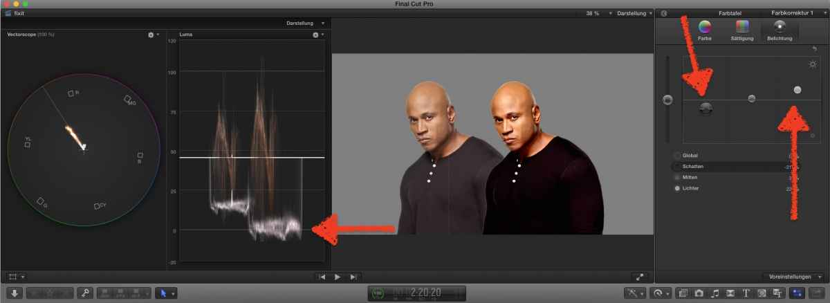
lower shadows, rise lights ...
(keep an eye on the scopes, avoid to go below zero/100 ... ahh, sorry mentioning that)
you notice: skin color gets a 'bump'
so, switch to Saturation...
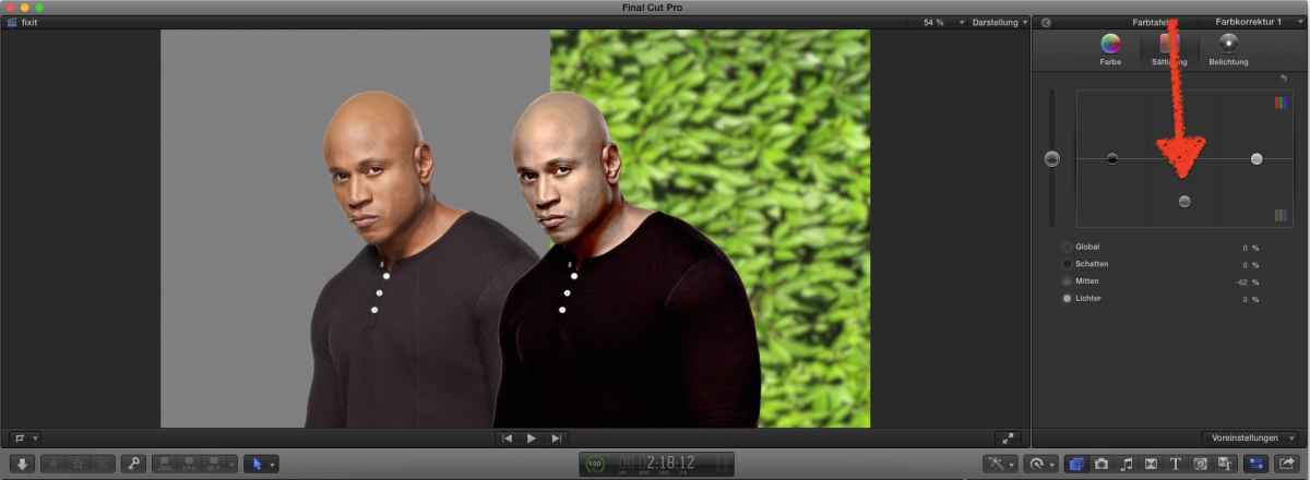
to adjust skin tones, try lowering the midtones ....
and, what I mentioned, on recording care for shallow depth of field ... ahh, sorry mentioning that

final word:
'grading' is an art, asks for years of experience (I don't have!). For example, to 'crunch' the shirt to a black mass is just plain ugly ... to create your own look isn't easy, to re-enact a look is … 'top notch'

consider, now meant as a serious advice, usage of ready-made looks, have a look in fcp.co own plug-in depository, or for commercial ones ... or even FCPX own library of Looks, you can tweak them, e.g. most are just 'too much', lower the amount gives nice results.
Please Log in to join the conversation.
Karsten Schlüter wrote:
Aar0n wrote: ....Exacts steps please? (I really don't know where to start apart from accessing the colour board) :S
What Tom said: exact steps depend on source materials look ...
but being grumpy in my first reply, here for a start:
begin always with the exposure settings
( ...before that, check your white balance ... ahh, sorry mentioning that)
lower shadows, rise lights ...
(keep an eye on the scopes, avoid to go below zero/100 ... ahh, sorry mentioning that)
you notice: skin color gets a 'bump'
so, switch to Saturation...
to adjust skin tones, try lowering the midtones ....
and, what I mentioned, on recording care for shallow depth of field ... ahh, sorry mentioning that
final word:
'grading' is an art, asks for years of experience (I don't have!). For example, to 'crunch' the shirt to a black mass is just plain ugly ... to create your own look isn't easy, to re-enact a look is … 'top notch'
consider, now meant as a serious advice, usage of ready-made looks, have a look in fcp.co own plug-in depository, or for commercial ones ... or even FCPX own library of Looks, you can tweak them, e.g. most are just 'too much', lower the amount gives nice results.
Thanks for your help. I managed to achieve a similar look.
Please Log in to join the conversation.
We live in an era where images have more inherent detail, resolution and dynamic range...
...yet people still want to crush, compress, vignette, 'promist' the crap out of these images.
Less is best. Learn the art of the subtle adjustment. Ask yourself WHY you want a certain look or mood?
FWIW - I actually don't mind something like the orange/teal look within FCPX but I would preserve skin tones and also knock the overall effect right down to.... < 30%.
Dean...
Karsten Schlüter wrote:
Aar0n wrote: ....Exacts steps please? (I really don't know where to start apart from accessing the colour board) :S
final word:
'grading' is an art, asks for years of experience (I don't have!). For example, to 'crunch' the shirt to a black mass is just plain ugly ... to create your own look isn't easy, to re-enact a look is … 'top notch'
consider, now meant as a serious advice, usage of ready-made looks, have a look in fcp.co own plug-in depository, or for commercial ones ... or even FCPX own library of Looks, you can tweak them, e.g. most are just 'too much', lower the amount gives nice results.
Please Log in to join the conversation.
