


- Posts: 8
- Thank you received: 1
3 Post Moderation Rule for New Boarders (25 Jan 2021)
New boarders will have their posts moderated - Don't worry if you cannot see your post immediately.
My captions look rubbish - any tips? (Motion 5)
- spuddlington
-
 Topic Author
- Offline
- New Member
-

Less
More
01 Apr 2015 08:31 #62153
by spuddlington
My captions look rubbish - any tips? (Motion 5) was created by spuddlington
Has anyone got some good advice for making my titles look a bit less dull and lifeless.
(This is my first time using Motion)
I'm editing a project and they've asked me to use the attached .jpg for the name captions. I'm finding it hard to make it look good. It looks flat and lifeless.
Any tips?
(This is my first time using Motion)
I'm editing a project and they've asked me to use the attached .jpg for the name captions. I'm finding it hard to make it look good. It looks flat and lifeless.
Any tips?
Please Log in to join the conversation.

01 Apr 2015 12:04 - 01 Apr 2015 12:16 #62156
by BenB
Replied by BenB on topic My captions look rubbish - any tips? (Motion 5)
1st, I added two more points on the text spline to make it curve more naturally with the banner.
Then I added drop shadow, angle -315, distance 8.
I also added a 1 point black outline to the text.
Finally, I added the Extrude filter (Stylize) to the banner graphic. Distance to 30, front brightness to 0, back brightness to 0.1. Try pulling the distance back to 20 for a more subtle look, and maybe adjusting the mix to soften it up a bit. Publish both of those in the template for sure!
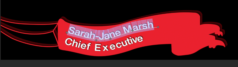
There a lot of little things you could do to jazz it up, but don't go overboard. Lower 3rd are supposed to give a glimpse of information, not distract from the actual visual story. Also, simplify it, I'd move the Fade In/Out behavior to the group, not put one on each individual layer.
Then I added drop shadow, angle -315, distance 8.
I also added a 1 point black outline to the text.
Finally, I added the Extrude filter (Stylize) to the banner graphic. Distance to 30, front brightness to 0, back brightness to 0.1. Try pulling the distance back to 20 for a more subtle look, and maybe adjusting the mix to soften it up a bit. Publish both of those in the template for sure!
There a lot of little things you could do to jazz it up, but don't go overboard. Lower 3rd are supposed to give a glimpse of information, not distract from the actual visual story. Also, simplify it, I'd move the Fade In/Out behavior to the group, not put one on each individual layer.
Last edit: 01 Apr 2015 12:16 by BenB. Reason: added information
Please Log in to join the conversation.
- spuddlington
-
Topic Author
- Offline
- New Member
-
Less
More
- Posts: 8
- Thank you received: 1
01 Apr 2015 12:13 #62157
by spuddlington
Replied by spuddlington on topic My captions look rubbish - any tips? (Motion 5)
That's great - I'm trying it out now. Thank you so much for putting some thought into this!!
Please Log in to join the conversation.
