


3 Post Moderation Rule for New Boarders (25 Jan 2021)
New boarders will have their posts moderated - Don't worry if you cannot see your post immediately.
New site design


Please Log in to join the conversation.
- peteramwiggins
-

- Offline
- Administrator
-

- The Administrator :)
- Posts: 1049
- Thank you received: 404
Administrator
Please Log in to join the conversation.


- Posts: 971
- Thank you received: 46
The green text is great, the screen layout much more clear, maybe on a mobile device it may be a problem...
I would suggest listing the actual problems so Peter W can work on it, saying it is harder without specifics is really not helpful, and given how hard Peter has worked on this site, a tad unfair!
Please Log in to join the conversation.
The bold horizontal white bars between posts, very distracting and glaring. I'm only just now seeing there is actual text inside of them.
EDIT* Now I see they are gone. Not sure why I saw them up until posting this replay.
The news articles are great, bright white text I can actually read. I'd add the date each was posted, though. When I read an article, how old or new it is matters a great deal in evaluating the information.
Suggestions, 2: First, these bright white bars between the posts, make then thinner, and gray so the text is easy to read. I swear I can barely see the post's date/time/number in them as is. Second, brighter forum text. Not everyone here has the eyes of a 20 year old.
I always get a 404 when hitting plain old " www.fcp.co ". I have to then hit one of the navigation buttons to get to anything.
"Whooops! Error!
Looks like something went wrong. Sorry!
404 View not found [name, type, prefix]: featured, html, tagsView
Nothing to See Here
Please use the navigation above or contact us to find what you are looking for."
I know Peter puts a lot into this site, I know full well how much effort these take, having run them in the past myself. But I have problems with it visually, and am stating this so Peter has some honest feedback. Just starting a conversation, Justine, chill.
Please Log in to join the conversation.
- Posts: 971
- Thank you received: 46
OH, update.. it seems the bold white is only if you edit, after I posted I looked for the white bars...no white bars, when I clicked edit...white bars...strange!!
I had the error as you did, but as Peter has explained, it is a work in progress, so maybe something was offline at that moment!!! Give it a few days!! He said 96 hours!!!
The text is I admit a tad grey, but perfectly readable on my 13 inch MacBook Pro laptop...
Maybe the ability to adjust font color would not be such a bad idea...
Please Log in to join the conversation.
- peteramwiggins
-
- Offline
- Administrator
-
- The Administrator :)
- Posts: 1049
- Thank you received: 404
Now that the frontage is up properly, we will take a look t the Forum as there are a few things that need a tweak
Administrator
Please Log in to join the conversation.

Please Log in to join the conversation.
Thanks again for a wonderful site.
I am noticing some small glitches, just passing them along.
I too suffer from OTEs(Old Tired Eyes) so I routinely enlarge the text on pages to help me read. Currently using El Capitan 10.11.6 / Safari 10.0.1 on rMBP 2012.
On the forum pages…
If I use a 2 finger, double tap to zoom in, all works ok, but if I use the command key & the "+" key some of the text will get chopped off on the right side of the text block.
I also noticed on the Forum Index pages that sometimes the dates of last post will be on one line and at bottom, but if the name of poster is short, then the date will split with a line break and the beginning will be up in the avatar/name. Makes finding the post date somewhat difficult. Don't know about others, but the last post date is one of the many clues I use while navigating. Maybe the Last Post date can be made a static text block so it always appears on bottom and no line breaks??
Well anytime you change a website design, you goin' get the lovers and haters. Some of the new design works for me, liking the better contrast, and some will just take some getting used to. Just really happy that fcp.co exists.
Happy New Year! May it bring joy and fulfillment to all.
Greg
Please Log in to join the conversation.

Please Log in to join the conversation.
- peteramwiggins
-
- Offline
- Administrator
-
- The Administrator :)
- Posts: 1049
- Thank you received: 404
Administrator
Please Log in to join the conversation.
- Karsten Schlüter
-

- Offline
- Moderator
-

- Posts: 3790
- Thank you received: 718
you got my comments while beta of the new site … glad the left indent got wider

but Greg's comment made me curious, and indeed, something's happening, look:
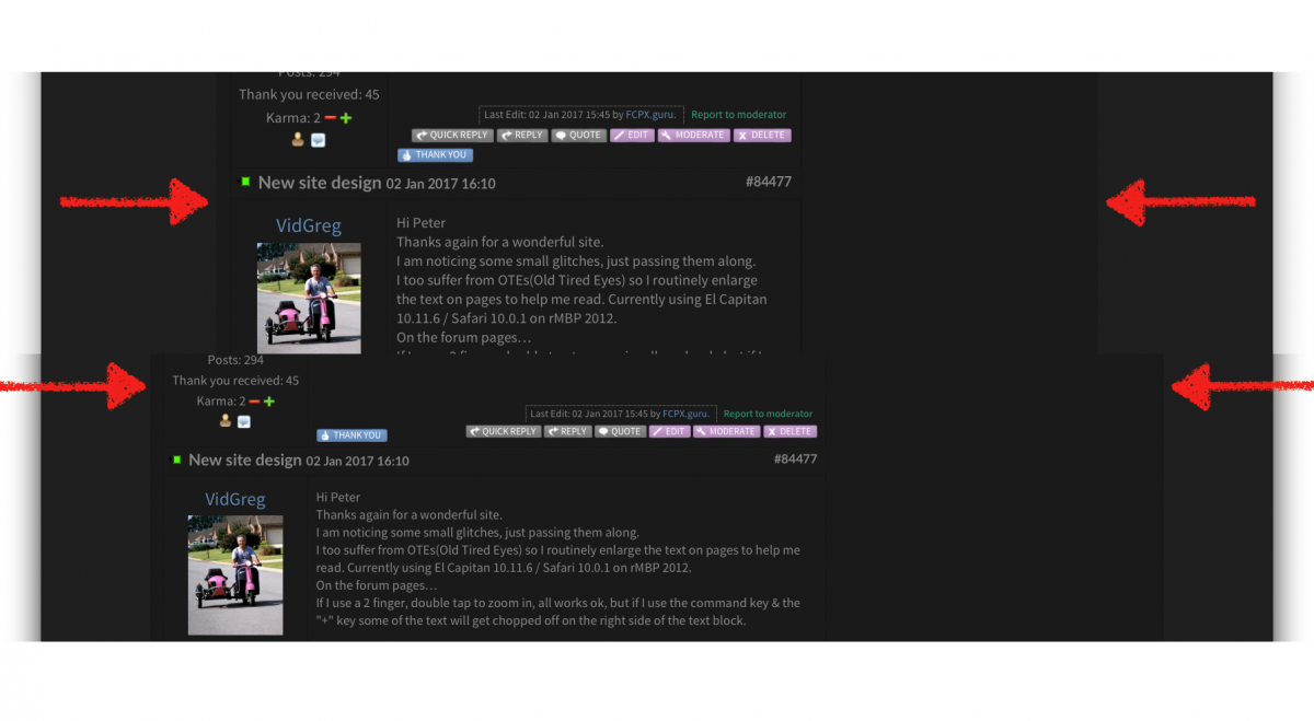
when I resize the text via cmd-+, the text gets bigger (intended) but the column gets smaller (?)!! Does this make sense?
@all:
the right area does indeed look 'empty/waste of screen estate' when you use ad-blockers, as <cough> I did <cough> while testing the new design. Give Peter a chance to finance our favourite playground and please switchOff Ad-block @fcp.co …
Please Log in to join the conversation.

Karsten Schlüter wrote:
@all:
the right area does indeed look 'empty/waste of screen estate' when you use ad-blockers, as <cough> I did <cough> while testing the new design. Give Peter a chance to finance our favourite playground and please switchOff Ad-block @fcp.co …
I agree ... this site is one of the very few that I have turned off my ad blocker for. I have supported many of the advertisers here and like to keep up to date on offers and/or any new products that may appear here. The other reason I have turned off the ad blocker for this site is the ads are presented in a non-annoying fashion and can be easily ignored if desired.
This site is an extremely valuable resource and Peter should be rewarded for his efforts. I have and will continue to support that effort in a small way.
Secondly, I find the new site design pleasing and I very likely have much, much older eyes than many who frequent here.
Peter can be assured, if or when I do see something in the area of site design I find troubling, I will mention that as well. For now, so far, so good.
Please Log in to join the conversation.

Please Log in to join the conversation.

I really like it a lot!!! Woeoe!!
One small thing: on Firefox on my iPhone 5, I can't log in to the forums because there's no Log In button displayed! (I do see the fields to enter name and pass though)
Please Log in to join the conversation.
